Glorious Mess: Why Cluttered Game Interfaces Feel More Like Home Than Anything Sleek Ever Could

Open up almost any major game released in the last five years and you'll notice the same thing: a clean, uncluttered screen, maybe a subtle health indicator in the corner, menus that slide in with a satisfying animation and then disappear politely when you're done with them. It looks great in screenshots. It photographs well for marketing. And for a lot of players, it feels weirdly... cold.
Meanwhile, somewhere out there, someone is reinstalling an old MMO from 2003 specifically because they miss the feeling of having seventeen overlapping windows open at once.
The Screen That Looked Like a Cockpit
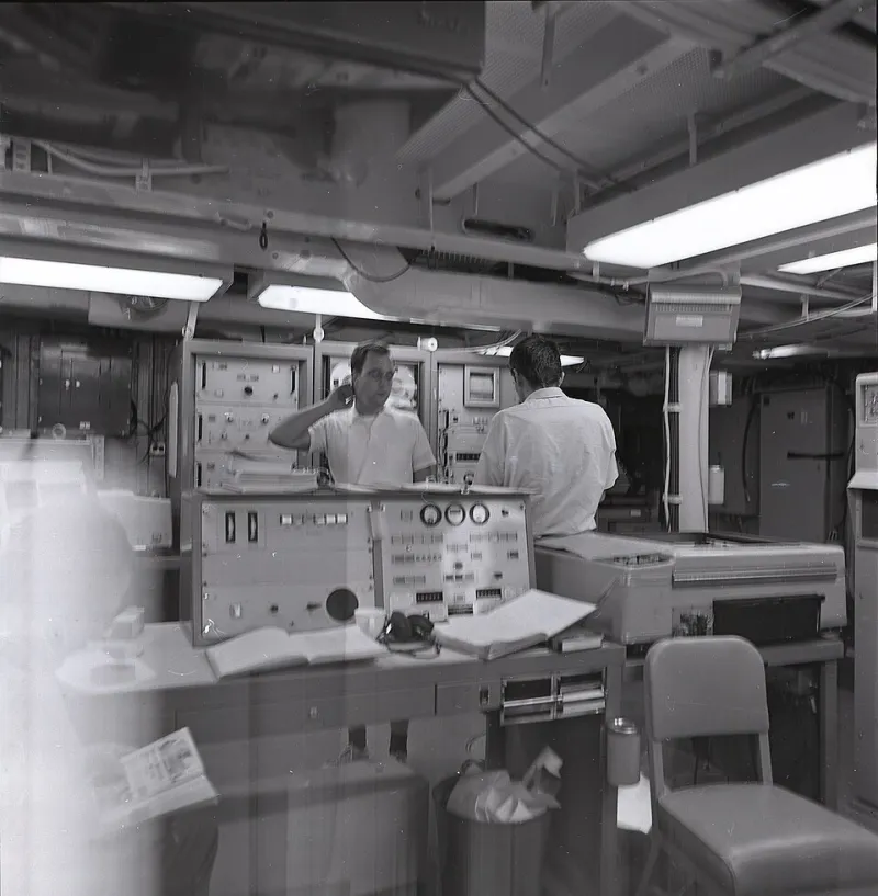
If you grew up gaming in the late 1990s or early 2000s, you probably remember a certain kind of interface. EverQuest had it. Ultima Online had it. Early versions of World of Warcraft absolutely had it before players spent years tuning it with addons. These were screens that looked less like a modern app and more like the instrument panel of a small aircraft — dense, slightly overwhelming, and weirdly alive.
Health bars sat in odd corners. Chat logs scrolled constantly in windows you'd accidentally resized to be too small. Inventory screens opened like actual drawers, items tumbling into grids that never quite fit everything you were carrying. The minimap blinked. The XP bar crept. Frame rate counters sometimes just... stayed on, because you'd forgotten to turn them off and now they felt like part of the furniture.
Nobody designed these interfaces to be comforting. They were designed to convey information, often by people who weren't entirely sure which information mattered most. But something about that uncertainty — that visual generosity, almost — turned out to hit different for the people who grew up inside it.
Clutter as Proof of Life
Here's one way to think about it: a busy interface is a busy world. When a screen is packed with data, it's implicitly telling you that things are happening. The chat log is moving. The auction house has new listings. Your buffs are ticking down. Even when you're standing still, the interface is breathing.
Minimalist design, for all its elegance, can sometimes read as stillness. And stillness in a game world can feel like absence. When the UI retreats to give you a clean view of the horizon, it's beautiful — but it's also quiet in a way that not everyone finds relaxing.
There's actually some loose psychological backing for this. Environments with moderate complexity — not chaotic, but not bare — tend to register as more engaging and, counterintuitively, more comfortable than stark empty spaces. Think about the difference between a cozy diner with mismatched chairs, handwritten specials on a chalkboard, and a buzzing coffee machine versus a sleek minimalist café where every surface is white and every sound is carefully managed. Both are fine. But one of them feels more like somewhere.
Cluttered game interfaces can work the same way. They feel inhabited. They feel like somewhere someone actually lived.
The Addon Economy That Proves the Point
If you need evidence that players actively want more visual information, not less, look at the addon and mod ecosystems that have grown up around games that dared to go minimal.
World of Warcraft's UI customization scene is enormous specifically because the default interface, while functional, doesn't give everyone everything they want to see at a glance. Players build elaborate configurations — damage meters, cooldown trackers, threat indicators, bags that sort themselves, maps that annotate themselves — that turn a relatively clean screen into something that looks like it belongs in a NASA control room. And they love it. They spend hours on it. They post screenshots of their custom UI layouts like other people post home renovation photos.
The same thing happens in games like Path of Exile, which ships with an interface that's already pretty dense and then watches its community add even more layers on top. The popular builds and guides for that game often come with full UI setup instructions. The interface isn't separate from the experience — it is part of the experience.
Why "Busy" Can Actually Calm You Down
This is the part that sounds backward until you sit with it for a second: for certain players, in certain moods, a cluttered interface is genuinely relaxing.
Part of this is nostalgia doing its usual work. If you associate a specific visual density with the hours you spent gaming as a kid — homework done, parents watching something else on TV, the house quiet except for the sound of a dial-up connection finally giving up the ghost — then that visual density carries emotional weight now. Loading up an old-school interface isn't just a gameplay choice. It's a small act of time travel.
But it's not only nostalgia. There's also something about having a lot to look at that can actually quiet anxious thoughts. When your screen is full of information to process, your brain has somewhere to go. It's a kind of structured distraction — not overwhelming, but occupying. The same way some people find it easier to focus with background noise than in silence, some players find it easier to unwind when their screen has texture.
Empty interfaces can feel like pressure. All that negative space is asking you to pay attention to the game itself, to be present, to perform. A busy interface, paradoxically, gives you permission to just exist inside it for a while.
The Aesthetic Is Having a Moment
It's worth noting that this isn't purely a retro thing. There's a growing current in indie game development that's consciously leaning into visual density as a design choice rather than a limitation. Games like Caves of Qud and Dwarf Fortress present the player with screens that would make a UX designer flinch — and their communities are passionate and deeply attached precisely because of that.
Even outside gaming, the "cluttered aesthetic" is showing up. Desktop customization communities on Reddit spend enormous energy recreating the look of old Windows 98 or early Mac OS setups, complete with overlapping windows, visible file systems, and taskbars packed with tiny icons. It's not ironic. People genuinely find it pleasant to look at.
There's a word that gets used a lot in these communities: skeuomorphic. It refers to design that mimics the look of physical objects — like early smartphone interfaces that made buttons look like they were physically raised, or note-taking apps that used a yellow legal pad background. Cluttered game interfaces are a kind of skeuomorphism too, in a way. They look like work. Like a real desk with real stuff on it. And there's comfort in that.
Room to Breathe, or Room to Hide?
None of this is an argument that minimalist design is wrong. Clean interfaces serve real purposes — accessibility, focus, reducing cognitive load for new players. A lot of people genuinely prefer them, and that preference is completely valid.
But the quiet persistence of players who seek out the cluttered, the busy, the visually loud — who reinstall old games for the interface as much as the gameplay, who build elaborate addon setups in modern games to approximate something they remember from twenty years ago — suggests that "clean" isn't universally the goal.
Sometimes you want your game to feel like a place where things are happening, where information is everywhere, where the screen is full enough that you can get lost in it a little. Sometimes the mess is the point.
And honestly? That blinking frame counter in the corner? Leave it. It's part of the vibe now.